The business card didn’t die. It got boring.
Paper is fine for exchanging information. It’s terrible at carrying presence. Metal, on the other hand, does something paper can’t: it communicates value before anyone reads a single letter. You feel it. You register it. And if you’re honest, you judge it.
One-line truth: a metal card is a tiny, portable signal that you’re not playing the cheapest version of the game.
Metal Cards Don’t “Look Premium”, They Behave Premium
Here’s the thing: people don’t remember most cards because most cards don’t survive the day. Corners bend. Ink smears. The card ends up in the hotel trash can with the event badge.
Metal changes the lifecycle.
Technically speaking, you’re swapping a disposable substrate (paper stock with coatings) for a rigid, wear-resistant medium that maintains edge definition, legibility, and surface finish after weeks of pocket friction. That matters because the second impression is often the one that closes: when someone finds your card again on their desk and you still look sharp.
Now, this won’t apply to everyone, but if your brand sells high-consideration services, consulting, real estate, B2B tech, finance, high-end creative, premium options like Metal Kards align with the buying psychology. A buyer is subconsciously asking: “Are you stable? Are you careful? Do you invest in quality?” A flimsy card answers that question in the wrong direction.
A Quick Reality Check on First Impressions
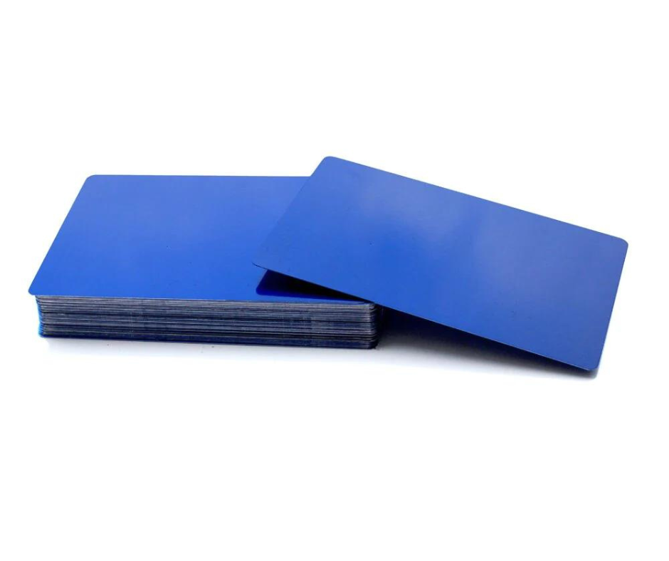
I’ve seen metal cards “win” rooms where the pitch wasn’t even perfect. Not because the card is magic. Because it sets the tone.
Weight is a cheat code.
Humans associate weight with seriousness. It’s not just vibe, there’s research behind it. A classic study in Science found that physical weight can influence perceived importance and judgment; participants using heavier clipboards rated issues as more important (Jostmann, Lakens & Schubert, 2009, Science). That’s not a direct “metal card = more sales” claim, but it explains why heft changes perception faster than words.
And perception is the opening move.
The tactile prestige thing (yes, it’s real)
A good metal card has “tactile grammar”:
– a clean edge break (no burrs, no jagged cuts)
– a finish that doesn’t glare like a mirror unless you want it to
– texture that feels intentional, not like a manufacturing accident
– consistent thickness that reads as engineered, not improvised
Cold metal in hand also creates a micro-pause. People stop. They look. That pause is oxygen for a conversation.
“Okay, but does it actually do anything?” NFC, QR, and the Not-So-Obvious Upside
If you’re only using metal for aesthetics, you’re leaving money on the table.
The smarter play is a hybrid: metal as the physical anchor, and a digital layer that turns curiosity into action. NFC is the cleanest implementation when it’s done right, tap, contact card opens, done.
Specialist note: NFC in metal requires thoughtful antenna placement and insulation because metal interferes with RF fields. That’s why the better manufacturers build a non-metal window, layered construction, or isolate the chip assembly so it can actually transmit reliably. If a vendor glosses over this, you’ll end up with a “premium” card that fails at the moment of truth.
Good uses I like (because they don’t feel gimmicky):
– Tap to open a vCard download (fast, low friction)
– Tap to a booking link for high-intent meetings
– Tap to a case study page customized by industry
– Tap to a “proof” page: testimonials, certifications, portfolio
Look, QR codes still work too. They’re just less elegant. NFC feels like the future; QR feels like compliance.
Design: The Card Isn’t a Poster
Most metal card design mistakes come from ego. People try to cram.
Metal gives you less forgiveness than paper because:
– reflective surfaces amplify bad spacing
– engraving/etching punishes thin strokes
– high contrast can backfire under certain lighting
So the rules tighten.
Typography hierarchy, but with restraint
Name first. Role second. Contact path third.
Everything else is negotiable.
Use one type family if possible. Two if you’re disciplined. I’m opinionated on this: three fonts on a business card is almost always insecurity dressed up as branding.
And don’t get cute with tiny text. If the card needs a microscope, the design failed.
One-line paragraph for emphasis:
Legibility is the new luxury.
Metals, Finishes, Thickness: Choosing Like You Mean It
This is where the “metal cards are metal cards” crowd gets it wrong. Material decisions change the entire experience.
Metals you’ll actually encounter:
– Stainless steel: tough, corrosion-resistant, common choice; great for etched designs
– Aluminum: lighter, often anodized; good for color but scratches can show
– Brass: warm, heavy, old-school premium; patinas over time (sometimes that’s the point)
– Titanium: strong and light, expensive, very “engineered” vibe
Finishes aren’t cosmetic fluff. They determine glare, fingerprint visibility, scratch masking, and how your typography reads under warm or cool lighting. Brushed finishes hide wear better. Polished finishes photograph well but show handling. Matte coatings can look gorgeous until they chip if the coating system is weak.
Thickness is the quiet flex. Too thin feels like a novelty. Too thick becomes awkward in wallets and can feel try-hard.
In my experience, the sweet spot is whatever lets the card feel substantial without becoming a pocket brick. Your audience decides what “substantial” means.
Practical Use: Don’t Hand These Out Like Candy
If you’re distributing metal cards the way you distributed paper cards, you’re doing it wrong.
Metal is a selective tool. It’s for moments that matter: decision-makers, high-value referrals, meetings you actually want to follow up on. Treat it like a premium handshake, not a flyer.
A simple approach that works:
– Use metal cards for A-tier contacts
– Use high-quality paper cards for general networking volume
– Make both point to the same digital identity (so your tracking isn’t fragmented)
And yes, you should track. If you can’t measure downstream behavior, you’re just buying expensive jewelry for your brand.
ROI: What You Can Measure (and What You Can’t)
Metal cards don’t produce ROI by existing. They produce ROI by changing behavior:
– recipients keep them longer
– people show them to others (the “this is cool” pass-along effect)
– follow-up rates improve when the card embeds a next step
What I’d track if I were running this internally:
– tap/scan rate (NFC/QR)
– meeting bookings attributed to the card link
– CRM notes tagged “metal card handoff”
– conversion rate for card-received leads vs baseline leads
– time-to-second-touch (how fast they engage after receiving it)
Caveat: attribution won’t be perfect. Humans aren’t pixels. Still, you can get directional clarity quickly if you set up a clean URL path and you’re disciplined about logging.
Sustainability (Because Someone Will Ask)
Metal can be more sustainable than paper or worse, depending on sourcing, coatings, and end-of-life.
Longer lifespan helps. Recyclability helps too, especially if you avoid mixed materials that are hard to separate. The messy part is energy intensity in production and specialty coatings.
If sustainability is part of your brand promise, don’t just say “eco-friendly.” Be specific:
– recycled content percentage (if available)
– packaging choices (minimal, recyclable)
– whether the card is designed for reuse (updates via digital profile rather than reprints)
People can smell vague green claims a mile away.
Pitfalls I See All the Time (and Quick Fixes)
Pitfall: Overdesigning the card until it becomes unreadable.
Fix: Reduce content. Increase whitespace. Make one action obvious.
Pitfall: Choosing a finish that turns into a fingerprint museum.
Fix: Brushed or matte, plus a coating that’s proven to hold up.
Pitfall: NFC that works “sometimes.”
Fix: Ask how the antenna is implemented in metal. If the answer is hand-wavy, walk.
Pitfall: Treating the card as the pitch.
Fix: The card is a trigger, not the story. Build a clean next step into the digital link.
The Honest Take
A metal business card won’t fix a weak offer. It won’t save a bad meeting. It won’t make people trust you if you act untrustworthy.
But when your fundamentals are solid?
Metal is leverage. It’s one of the few physical brand assets that can still interrupt someone’s autopilot, buy you a second look, and make your follow-up feel expected instead of random (which is half the battle).




Carlos Dattoli